Evaluation

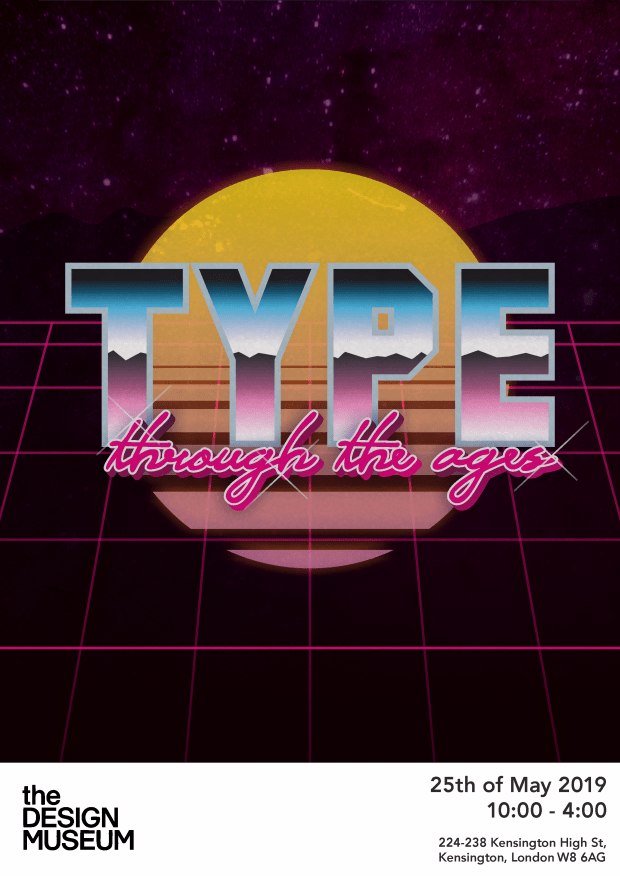
For this project, the final aim was to create a poster for a  typography exhibition held at the Design Museum in London. For my main point of inspiration, I used previous designs which had been used for the same exhibition as part of my inspiration as it gave insight into the setup for something along those lines and the way that I could generally lay out and set up the information.

The issue that I had at first for this project was my personal time management alongside being unsure where to take my project. To overcome this issue and for my project to be finished on time, I overcame the time management issue more by doing a lot more of my work in my own time rather than at college, and was able to get it finished off a lot quicker than I would have otherwise. For the issue of inspiration, I decided on a whim to look over types of typography across history, and then decided to go into it fully for my main project.

Overall my skills have developed on this one as I went out of my comfort zone a lot more. A lot of the designs that I do, in previous college work or in my skills at work, are generally based on modern design, being primarily simplistic basic designs. However, with this topic and inspiration I was able to try some things completely new. I think this is the main reason I chose the 80s design as my favourite as it was by far the least simplistic design of the ones that I’d done, involving a lot more interesting patterns, gradients, filters, glows and general effects to fit it more with that style and  simultaneously separating me from the trends I was used to, which was a good learning experience.

If I was to do it again I’d do a lot more experimentation with topics, potentially designing posters based on different time periods to the ones that I covered or potentially just go off a completely different brief to see how the results varied.

Final Poster Design

The poster that I decided to use for my final piece was the original one that
I made, based on designs and typographic usage from the 80s. The first
thing that I decided on, since it was a typography-based project, was the
text itself to go onto the poster.

80s

The font used for the word “TYPE” is called Intro font, specifically the
Blackline version. I used this as it fit the style being a strong, bold font, and
the inside line on the font gave for a better effect since that was a trend
common in the 80s. I decided to give these posters a subtitle and went for
“Through the Ages”. It fit my personal project by linking into me having a
range of designs for different eras, and allowed me to show off multiple
types of typography for a certain time period. The font I used for this
subtitle is called Outrunner, a font made specifically to mimic the cursive
subtitle fonts used in a lot of 80s poster designs, primarily ones in this style.

The next aspect of design that I worked on to bring it all together was the background. This was important as it linked in the whole style and made it a fully fledged 80s poster. The first thing I created for the  design was the sun. This was a simple shape to make,  creating a circle and having lines of gradually less width  cutting through them, and then applying a pink and  yellow gradient. A light yellow drop shadow was applied  after which helped bring all the colours together and give it a soft glow. For the grid, I manually drew out the lines and applied a light pink glow to them to make them stand out more. For the background behind that, I used gradients, colours and a stock photo of space to give it the same effect as posters it was inspired by, Finally, to bring the full design together, I applied a film grain filter over the full thing. This kept the background colours a bit more muted as they stood out too much at first, and the film grain effect  itself was visually there and fit the inspiration and completed the poster.

Poster Designs

After working on the shape experimentation, I realised I wanted to develop my final designs based off the idea of how graphic design and typography have been different through history. For this I wanted to look at a range of iconic times in design, specifically applying to the differences in the way text is used, through history. This specifically involved looking at poster designs and the trends that were common in the specific time periods I decided to look at, so therefore I had to research all aspects from design, typography, usage of shapes, usage of colours and features for backgrounds of image.

20

The first design that I set up was based on the design trends of the 1920s, being a very vintage format. To keep in with the designs from the style, I did the full design in black and white. This kept the design simple and also helped relate it to those times more, as basically all visual media was only able to be digitally represented in black and white, in an age before colour television or any type of computer. I used a lot of patterns in this sort of floral-based theme, as well as using fonts that were fitting or similar to ones commonly used at the time. For the word Type I added circles into the interiors of the body of the text to mimic the way they had lettering with lights goig through the middle.

70

For this next design I decided to look at the 1960-70s. Around this time there was a new wave and movement based on hippie-culture, closely associated with graphgical and musical trends at the time. I decided to make something, the background especially, a lot more psychedelic background, with a big mass of wavy, completely random shapes and designs that all bend and curve and work together. On top of this, I used the same font design for all of the wording, something I only did in this design. I decided to this cause I believe I found the perfect font fitting of the time, perfectly groovy and curvy and unique to fit in. Then I added a bold stroke around the full thing and added a “Shadow” by blending together copies of the stroke in a 45 degree angle down and to the right, giving the effect of a shadow and movement. To bring the design all together, I used a lot of bold and bright colours. This helped with bringing together the psychedelic aspect of the background, the groovy aspect of the text in the foreground, and overall reflected the culture and general graphic design trends which were common at the time.

90

For my next design I decided to base it on graphic and typographic trends common in the 90s. The first step I decided to do was to create the background for the image. In my mind, I felt this was the most important part of this piece. Retrospectively, the 90s isn’t known as much for it’s usage of typography, and rather more so the usage of bold, bright colours, interesting shapes and patterns on bold backgrounds to make for a very garish, modern and interesting effect. For this, I used a range of pastel, bright colours to bring the the togerher. The main bacgrkound I deicded to use was the blue, and on top of this used varying colours of yellow, pink, turquoise and voilet to have everything be differentiated from the design, either being complementary or contrasting to the background. Then, I created a range of shapes which were commonly used in designs at the time, such as squiggly lines, triangles, bold circles, patterns with lines, triangles and cones, applying 3D effects to some items, outlines to others, and to some items neither to have everything be differentiated in its own way but still similar enough. On top of this, I made a few bold shapes of the previously mentioned colours to use as backgrounds for the individual letters, placing the letters on top in white with a bold black shadow to give a good amount of contrast and have them stand out. For the subtitle, I drew out something alike a text box. This wasn’t specifically based on anything 90s based but the quirkiness of it and keeping it all in boxes helped make for a more uniform design which accentuated being based off the same theme.

Shape Experimentation

To start off my experimentation, I decided to use my inspiration from the grid-based posters and use the way that shapes were used to my advantage and develop these into their own, new designs.

2

The first one that I decided to do was a standard shape setup. With this I just picked three random colours, cut out random shapes and threw them into the canvas that I drew. That originally made  apattern similar to this and then I made some adjustments to make for more appelaing looking spacing and an overall cleaner design.

3

For this next one I decided to look at things a lot more uniform, to a certain extent. I dedicated half of my canvas to keeping it plain black for no particular reason except to break it up a little. Then for the other half I cut out an assortment of yellow squares and laid them out in a pattern. I wanted to do this to experiment with keeping things simple and organised but at the end this was my least favourite of the bunch.

4

The next design I decided to work on was to look at using background colours. To keep it simple and focus more on the background I only decided to use simple black shapes on top of it. The main issue with this setup ended up being the simplicity of the colours, I wasn’t able to properly see and utilise a background for the image since I had no foreground to base it off.

1

The last setup I used was a lot more complex and interesting than the rest. With this I first decided on a colour scheme, using a solid teal-blue colour alongside complementary yellows and oranges to make everything contrast, stand out and work together. I used an assortment of shapes in all different sizes in order to make everything unique. On top of all of this, I cut out the shape of the word TYPE, and from there I angled and place it on top to bring the poster together.

The main thing I got from this experimentation was the usage of shapes, in the final design especially. This ended up reminding and inspiring me of 90s graphic design with bright colours and a range of intereting shapes, which gave me the ida tha I used in my final project to experiment with graphic design and typography through the ages.

Inspirations

For my main form of inspiration I looked at the existing works of Tom Davie, who had previously created poster designs for typography exhibitions. To differentiate myself from his work a bit more I decided to focus in on his grid-based poster designs that he had made. I initally wanted this as I thought it would be a good starting point to base my own designs off, using shapes and generally designing in a more comtemporary, fully digital and simplistic way.


I primarily used these as inspirations for ways to lay out my information. Going forward, I decided to experiment a lot more with shapes in my designs and used that to develop my overall theme that I wanted to go for and used in my final designs.

Contact Sheet

For this task I went around with a camera and took pictures of examples of type that I could find in the real world. With this I was able to see a range of different ways that typography is used publicly, from colour schemes to the different classifications of  type that are used, and how they may vary depending on what they are used for, overall letting me get a different insight into it.

photos

From here I was able to look at the range of typographies and the interesting ways that they were used, which gave me a range of general inspiration for my typography posters.

Anatomy of a Typeface

To get a further understanding of typograhy, fonts and typefaces I decided to look at the anatomy of a typeface. This involves looking at the individual parts which make up each letter an general typefacing an defining what they mean.

anatomy


BASELINE
The baseline is the imaginary line on which all of the text rests. Parts of certain letters may go below the baseline but other than that it is regarded as the bottom of each letter

MEAN LINE
In typography, the mean line, also (and more simply) known as midline, is the line that determines where non-ascending lowercase letters terminate in a typeface.

ASCENDER LINE
The invisible line marking the height of ascenders in a font

X-HEIGHT
The x-height is the length between the baseline and the mean-line in a typeface. This usually varies by letter so it uses the mean letter height, but in a font this is usually the height of the lowercase letter x

ASCENDER
As the name suggests, an ascender is a part of a letter that extends above the level of the top of an x, such as in the letters l and f

DESCENDER
Similarly to ascender, a descender is a part of a letter that extends past the x-height, but in this case it goes blow by going below the baseline, such as in the letters y and g

TITTLE
A small distinguishing mark, such as an diacritic on a lowercase i or j, also known as a dot

STEM / STROKE
Vertical, full-length stroke in upright characters

TAIL
The descending, often decorative stroke on the letter Q or the descending, often curved diagonal stroke on K or R is the tail. The descender on g, j, p, q, and y are also called tails

SERIF
In typography, a serif is the little extra stroke found at the end of main vertical and horizontal strokes of some letterforms

BAR
The (usually) horizontal stroke across the middle of uppercase A and H is a bar. The horizontal or sloping stroke enclosing the bottom of the eye of an e is also a bar. The stroke along the top of an uppercase T is also a bar
LOOP
The enclosed or partially enclosed counter below the baseline of a double-story g

COUNTER / APERTURE
In typography, the enclosed or partially enclosed circular or curved negative space (white space) of some letters such as d, o, and s is the counter

SHOULDER
The curve at the beginning of a leg of a character, such as in an “m”

BOWL
In typography, the curved part of the character that encloses the circular or curved parts (counter) of some letters such as d, b, o, D, and B is the bowl

After looking at this I have a lot more knowledge on typefaces that I can use to my disposal in analysis and discussion

Font Analysis

For my project I looked over a range of fonts of all different styles to get a further understanding into the origins of type as well as analysis of the specific fonts themselves and their usages.

Arial
The first font that I looked at was Arial. This is perhaps the most standard Sans-Serif font, itself being designed in a way that it uses the same measurements as Helvetica to allow for a public-domain version for print compatability.
Although this font is standard, I wouldn’t personally use it in any of my projects for that reason. A standard use I’d expect for this font is for document use more than anything, in education and in business.

Futura
The main thing that I like about Futura is the versatility. It’s a very one-size-fits-all font, being able to used in almost any aspect and working great. Typically I use this a lot in the workplace and can be applied to leaflets, signage and generally all aspects of branding.
I didn’t end up using Futura in any of my designs but I liked looking at the versatility and I easily could’ve put it into any of the designs I did without ruining the effect

avenirbodonicenturycgothicfrutigergaramondlobstertimes

Typography

The first bit of work I did for this project was create a paragraph going over typography. Here I covered a range of terms alongside an analysis of Fonts.

Typography is the process and techniques of displaying text to make it look legible and appealing for people to look at. There is a range of descriptions that can be applied to the text, the style and overall arrangement.

Serif
A traditional style, Serifs are the small lines placed usually at the end of a large stroke in a letter or symbol within the font. A Serif font is one which has these present in most lettering and symbols. There are four types of Serif – old style, transitional, Didone and slab serif.

Sans Serif
Sans Serif fonts are fonts which don’t include the Serif on the end of letters and strokes, instead being more simplistic in their design. These usually have generally less stroke width variation than Serif fonts too, being usually used to represent simplicity and modern style.


Evaluation

The majority of my gathered research has been through online sources, getting a vast range of information from a variety of sources for a variety of topics. The main way that I interpreted this research was through analysis, covering the effect it personally had on me and my own opinions on it. I was able to document this through collating it onto A3 size sheets, which gave me a range of ways to document the information that I’d looked at, as well as a way to collate my own personal views on it. Given the topic of the units, I had a range of mediums at my disposal in order to get the full potential out of a research project. If I was to do it again I would go back and use these better to my advantage. During the project, I primarily focused on doing online research and didn’t look into using books or any other type of primary research, so next time I would like to try to focus on things that I didn’t do and use them to improve my work. Although it wasn’t a primary form of research, it still gave me a range of information from many types of sources that I was able to properly use.

In this project, I had a lot more trouble with the case studies than I did the timeline project. This was a personal difference due to the fact that I’m not as proficient in analysis, so having to focus a piece of work on an analysis of an artist and their work was outside of my comfort zone personally. Despite this, I still worked at it and learned a lot from doing the case studies, both about the artists and art styles themselves but also I learned a lot about getting other peoples opinions on art and how the personal analysis of work is important to keep in mind. In the future, I plan to keep in mind and research-based on other people’s analysis, either through online research or in books to get a wider range of views.

Although the timeline was easier on my end, I still had a fair share of issues while making it. One of the things that made it better for me is that I was able
to use design a lot better in it, laying out the information was much more of an interesting challenge than the case study since I had to consider that I
was focusing on multiple sources and types of information rather than one specific piece. One of the main issues that I had was to get proper historical information as the timelines went on. Since there’s been more time, there’s a lot more documentation and historical analysis online and in books for events in the 1960s and 1970s, but in the case of the 2000s and 2010s there’s a lot less online, so I had to work a lot more independently on that side of it. I decided to focus primarily on technological advancements, especially in the 2010s, in terms of historic events since I was able to use it to relate it a lot more to the art world and the way that it’s been developed, such as in terms of Virtual Reality or 3D Printing.

Overall my main issue with this project was my time management. Due to poor timekeeping and absences, I missed a lot of lessons at college and ended up losing a lot of time that should’ve been dedicated to the project. Although not directly detrimental to the project since I had a lot of time to go over it, a lot of things tended to be lost in translation such as through blog posts or between work due to larger time gaps between work. In the future, I need to keep on top of my time management by being sure to attend every lesson.