To start off my experimentation, I decided to use my inspiration from the grid-based posters and use the way that shapes were used to my advantage and develop these into their own, new designs.

The first one that I decided to do was a standard shape setup. With this I just picked three random colours, cut out random shapes and threw them into the canvas that I drew. That originally made apattern similar to this and then I made some adjustments to make for more appelaing looking spacing and an overall cleaner design.

For this next one I decided to look at things a lot more uniform, to a certain extent. I dedicated half of my canvas to keeping it plain black for no particular reason except to break it up a little. Then for the other half I cut out an assortment of yellow squares and laid them out in a pattern. I wanted to do this to experiment with keeping things simple and organised but at the end this was my least favourite of the bunch.

The next design I decided to work on was to look at using background colours. To keep it simple and focus more on the background I only decided to use simple black shapes on top of it. The main issue with this setup ended up being the simplicity of the colours, I wasn’t able to properly see and utilise a background for the image since I had no foreground to base it off.
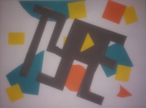
The last setup I used was a lot more complex and interesting than the rest. With this I first decided on a colour scheme, using a solid teal-blue colour alongside complementary yellows and oranges to make everything contrast, stand out and work together. I used an assortment of shapes in all different sizes in order to make everything unique. On top of all of this, I cut out the shape of the word TYPE, and from there I angled and place it on top to bring the poster together.
The main thing I got from this experimentation was the usage of shapes, in the final design especially. This ended up reminding and inspiring me of 90s graphic design with bright colours and a range of intereting shapes, which gave me the ida tha I used in my final project to experiment with graphic design and typography through the ages.
