To get a further understanding of typograhy, fonts and typefaces I decided to look at the anatomy of a typeface. This involves looking at the individual parts which make up each letter an general typefacing an defining what they mean.
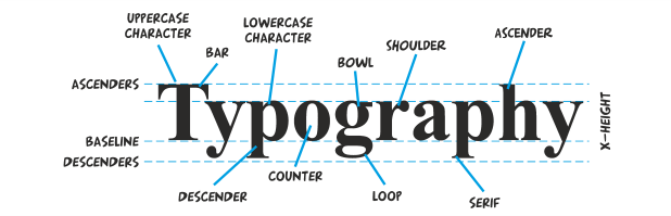
BASELINE
The baseline is the imaginary line on which all of the text rests. Parts of certain letters may go below the baseline but other than that it is regarded as the bottom of each letter
MEAN LINE
In typography, the mean line, also (and more simply) known as midline, is the line that determines where non-ascending lowercase letters terminate in a typeface.
ASCENDER LINE
The invisible line marking the height of ascenders in a font
X-HEIGHT
The x-height is the length between the baseline and the mean-line in a typeface. This usually varies by letter so it uses the mean letter height, but in a font this is usually the height of the lowercase letter x
ASCENDER
As the name suggests, an ascender is a part of a letter that extends above the level of the top of an x, such as in the letters l and f
DESCENDER
Similarly to ascender, a descender is a part of a letter that extends past the x-height, but in this case it goes blow by going below the baseline, such as in the letters y and g
TITTLE
A small distinguishing mark, such as an diacritic on a lowercase i or j, also known as a dot
STEM / STROKE
Vertical, full-length stroke in upright characters
TAIL
The descending, often decorative stroke on the letter Q or the descending, often curved diagonal stroke on K or R is the tail. The descender on g, j, p, q, and y are also called tails
SERIF
In typography, a serif is the little extra stroke found at the end of main vertical and horizontal strokes of some letterforms
BAR
The (usually) horizontal stroke across the middle of uppercase A and H is a bar. The horizontal or sloping stroke enclosing the bottom of the eye of an e is also a bar. The stroke along the top of an uppercase T is also a bar
LOOP
The enclosed or partially enclosed counter below the baseline of a double-story g
COUNTER / APERTURE
In typography, the enclosed or partially enclosed circular or curved negative space (white space) of some letters such as d, o, and s is the counter
SHOULDER
The curve at the beginning of a leg of a character, such as in an “m”
BOWL
In typography, the curved part of the character that encloses the circular or curved parts (counter) of some letters such as d, b, o, D, and B is the bowl
After looking at this I have a lot more knowledge on typefaces that I can use to my disposal in analysis and discussion
