Logo & Typography

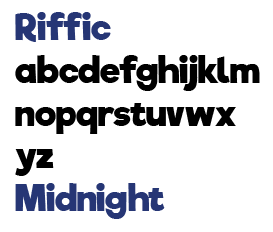
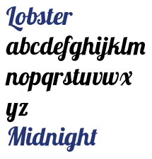
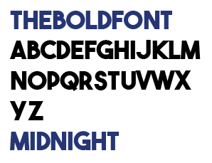
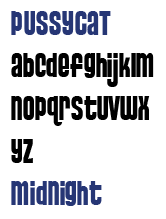
The next step in my design was to use the fonts that I considered in order to create logo designs. Developing my logo was a very important part of my branding as it meant that I had something concrete to work with, using it in all my designs and creating a proper uniform brand.

logo1

For this logo, I experimented with the moon icon and I used it in place of the letter D. Although I thought it was a good idea, in practice it didn’t read as well as it looks like it says “MI NIGHT” as the D is difficult to identify, and therefore I didn’t go ahead with the design.

logo2

I kept this logo design very basic, focusing on the smaller aspects of the logo – the Midnight colour and the letter M. These together made a very basic icon but it was too simplistic to use as an actual logo.

logo3

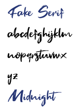
For my logo, I decided to experiment a lot with the Fake Serif font and the ways I could use and experiment with it. I chose Fake Serf due to the graffiti-like grunge design which felt fitting to my general design formula and spray can prompt.

logo4

One of the ways I decided to experiment with the logo was by changing the case of the type. Although a basic, minor change, it provided a different way to look at the logo. With this I broke general convention for the font and the way it was used, acting almost rebellious which felt right at home with the graffiti and spray can prompt.

logo5

For this logo, I decided to experiment with the type and case more by using different types of capitals and lower case in different places. More specifically, I separated “Mid” and “Night”. I liked the way that the layout came out in this design as it used the space and alignment well together. However, I didn’t think it flowed as well as a proper logo as it separated the word “Midnight” when it was meant to be one word.

logo6

I developed my logo further by going back to the idea of using the moon icon in my design. For example, I decided to re-purpose the crescent moon that I used in my initial logo design, flipping it and creating negative space with the type in order to make it out as if letters had been cut out from the main logo. When I made the circle shape central to the text it seemed to cover up the “id”. Although it had no specific meaning, I thought it was interesting that it covered up those letters and nothing else so I decided to use the negative space created by them in the logo design.

logofinal

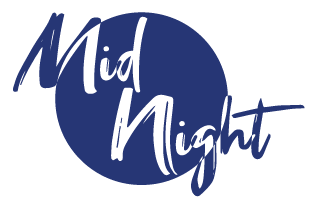
In this final logo, I took the moon idea a step further and decided to use the entire circular moon shape rather than just using the crescent moon. Once again I used the idea of the negative space with the text in order to make it stand out and look more unique, bringing attention to all of the text so that it looks more appealing overall. In the end I decided to go ahead with this logo and used it in my final design.

Font

For my next step in my design I decided to start working digitally. I thought a good place to start with this would be by working on the font choice to work on my overall brand. I decided to work on this first as it would be a good starting point to base my work around, as it meant that they would all have a level of consistency in the design allowing me to compare them better to see which later developments would contribute to an overall design.

Coolvetica

Coolvetica

The first font I decided to work with was Coolvetica. I chose this font as it felt like a good general font that would be a jack of all trades, being able to work as a title and as the body text in any of my branding. In the end I decided that it would work well as a body text and a subtitle font, but I wouldn’t use it as the primary font in the brand for the logo or titles.

Riffic

Riffic

I decided to look at this font due to its more bold design, as it stood out a lot when compared with other fonts that I had considered. An issue with this font is that it wouldn’t be something that would work as a general type, instead only standing out as a title. As well as this, the cartoon-like nature of the font is something that I thought wouldn’t fit the darker theme that I wanted to go for with my brand.

Lobster

Lobster

The main reason that I considered this font was due to the semi-cursive design, looking formal but also clearly being informal, being a good middle ground font which could stand out in both aspects. In the end though, I didn’t feel like it fit as it was very clean in design, and wouldn’t have worked as well in the darker, more grunge theme I was going for in my brand.

The Bold Font

The Bold Font

This font stood out to me the most as it is, as aptly named, a bold font. All the letters are large and stand out massively from anything else when they are used together. I ended up using this font to make one of my favourite logo designs, incorporating it in to the iconography to make a complete design. However, similarly to the Lobster font, I felt like it didn’t work with the theme I was going for.

Pussycat

Pussycat

This was a font that I liked the look of in theory but in practice I didn’t think it worked. I originally thought it would be a good idea similarly to Coolvetica as a general font for body text and titles, but when using it I felt like it was too small and compressed, and wouldn’t fit the theme I was going for as well as being difficult to read overall.

Fake Serif

Fake Serif

In the end, I decided to go with this font as my main font in my designs, including using it in my logo designs and overall branding. I chose this font as I felt like it worked extremely well with the general design I was going for, not necessarily being too clean but also being readable. Not being too formal, but also a bit less standard. Overall this worked great for the brand that I was developing.

Mono Printing

For my next step in development, I decided to focus on mono printing. This is a method of printing by overlaying inks with different levels of paper, giving you the ability to imprint your own patterns onto the paper. This is done by overlaying a plain paper over ink, and then the pattern over that. Tracing over the pattern with different materials imprints the ink, allowing you to control the intensity of the imprint by putting the pattern down softer or harder.

With this method, I decided to do the mono printing on my existing patterns that I previously designed, as well as a quick sketch of a logo idea that I had. The main pattern I designed with mono printing was the pattern involving the continents. With this, I decided to use different mediums or different types of continents, as a way of making them all stand out from each other, but with the printing still keeping the image look complete, as if they’re meant to be together despite their differences.

For the midnight logo, I first printed over a patterns that I had previously designed, specifically the one which was first used as a unique pattern to show off all the colours I was working with. In this pattern, there was a gap missing in the middle of the two sets of patterns, and I decided this would be a good place to fit in my logo. I wrote in my name, “Midnight”, in the space, leaving the D blank to fill it in with the reverse crescent moon shape that I decided to start working with. This didn’t give the most desired effect, as the lightness of the pattern blended in with the background, so it didn’t stand out very well. As well as this, when mono printing is done, the actual print itself prints backwards onto the paper, so the word “Midnight” is reflected.

Pattern Experimentation

For part of my practical work, I decided to experiment with different types of patterns in my design. This was useful as it allowed me to experiment with varying ways of using lines and colours, which gave me a range of possibilities and inspiration for designs to use for my can and the brand.

The first one I did wasn’t as much a pattern but was more a way for me to experiment with the different types of colours that I was thinking of using, giving me a visual idea of how they worked together. This was one of the main prompts that I had to use the yellow a lot more in my designs due to the way it stood out from the rest and therefore made me think about the way it would make the Midnight colour stand out in my designs.

The next pattern that I worked on was a way for me to experiment with light, by putting in a central object and then creating a basic gradient of colour around it, gradually getting darker the further away it got from the middle. To fit in with my theme of midnight, I decided to make the light source in the centre a moon. Then, to fit in with the overall night theme, I used a variety of colours in shades of blue, while also having slightly different shades, such as a turquoise colour. Overall, this pattern was good as it let me also experiment with colour and shading in an interesting way.

The next pattern I used was a lot more different than the rest as I used a completely different medium, focusing on drawing in chalk rather than in pen. This let me get a set of completely different colours and gave the design an overall softer theme. The change in colour let me consider my work from a different point of view, and the different mediums that I could use to design it.

The fourth pattern that I worked on was more of a landscape design. This let me see how it compared to an actual landscape and the ways that the colours worked together comparatively. The primary example of the way that it worked differently was due to the increased visibility of the contrast of colours. In a normal landscape, all the colours will tend to blend together naturally, creating a perfect composition of colour and depth. Since my work was completely different looking from an actual image, that showed me that the overall colour theory for my palette wasn’t as up-to-snuff.

The fifth pattern I worked on was an attempt of working with patterns, and the way I could use colours to make certain patterns stand out from the rest. Primarily I decided to use a lot of lines in my pattern design, creating interesting crosses and swirls. I think the desired effect was achieved with this, each colour stood out in it’s own way and no pattern was too plan to not be clearly seen on the canvas.

My final pattern was an interesting one I did where I decided to work on a design based on the continents. This is placed in the Atlantic ocean, so pattern itself involves mostly Europe and Africa, but with a small section of Eastern South Africa on the bottom left. I decided to make each continent stand out by drawing them in different colours to the ones that are normally in my palette – using warmer colours such as red, brown and orange as a stark contrast to the colder blues and greens I typically use. This was done as a reference to the moon aspect of the Midnight theme being about controlling the waves, representing this idea by drawing the ocean and the waves in the same blue colours.


Colour Experimentation

With my prompt colour, I also wanted to take a look at other colours that I could use to connect to it, focusing on ones that are complementary as well as ones which contrasted completely, and I evaluated which would be the best choice to use alongside my Midnight colour in order to create an appealing brand.

The colour that I was given was a dark, almost navy, blue colour. This colour I would consider very cold, so that was an important aspect to consider when thinking about the other colour options that I had. For example, when considering which colours worked the best for contrasting against it, I was able to focus on more warm colours, such as orange and yellow. The use of contrast in my work was important as it allowed all the colours to stand out more, and making the blue stand out was one of my main goals from the prompt.

The first colour that I considered using was orange. Orange is known as a complementary colour for blue, meaning that when they are put together they both stand out a lot more. This was a good option in terms of purely colour theory, but the main issue that I came across is that I couldn’t think of many ways to appropriately make it fit in with the blue. Overall, orange was a colour that links a lot with light. I attempted to use it slightly in my brand, but in the end I focused on other colours.

Since orange didn’t work out too well, I tried to work using yellow. Although similar, the lighter shade of yellow meant that it was more appropriate for a lot of the general themes that I had come up with for my mood board, such as being used as a colour for the moon, and therefore linking more to the general idea that I had for experimenting with space as a whole. In the end, I decided to use yellow a lot in my branding, often found complementing the blue.

I had found a complementary/contrasting colour, but then for the rest of my designs I wanted to use a colour which worked well alongside the blue but didn’t exactly make it stand out to the level that the yellow did. In the end, due to focusing on my space theme, I ended up using a range of pink and purple colours. By using a light gradient, I could incorporate multiple levels of colour while still keeping it all similar in a theme. I primarily used these colours in the space areas of my branding, which mainly kept it confined to the background of the image rather than directly in the label itself.

Midnight

For this prompt, we had to choose between a range of various spray can colours. This was a difficult decision because immediately lots of different colours all gave me a range of ideas and ways to take the prompt of creating our own spray can. In the end, I decided to choose the colour “Midnight”, which was a navy blue.472025_source_1541542827

This stood out to me because of a lot of the possibilities and the way that I could link this colour to nature, the ocean, and things relating to midnight itself. To do this, I created a large mood board/spider diagram featuring a lot of the things that I could base the basic prompt on, as well as features that connect to that, some extended features linking together to truly build upon the theme.

The three main themes that I stemmed off the name were “Nature”, “Night” and “Darkness”. The “Nature” branch spread about a lot, developing into types of caves, trees, the ocean, all different types of wildlife. The “Night” branch spread into focusing on the moon, stars, space, and also nocturnal animals, which linked into the wildlife aspect of nature. Finally, for dark, I considered ways of using colour, such as contrast, and also the idea of isolated places, such as deserts and abandoned buildings.

Line, Tone, Shape and Texture

To experiment with all that I had researched, we split our work into four different processes – Line, Tone, Shape and Texture. Each of these was an extremely basic premise to go off, but that gave me a lot of freedom and flexibility in designing my work.

Line

Line 1

The first design I did involved lines, and it created an effect similar to those of interlocking pipes. To start out with line, I wanted to create an intricate design, highly involving lines that overlapped and intersected. In order to make it so you could tell the line were intersecting and curving as I intended, I decided to give them some width so that this effect was able to be seen. Since I wasn’t working with colour on any of these tasks, I wasn’t able to use it to differentiate each of the lines from each other. I then decided to give each line a unique pattern so that they could be identifiable from each other, the patterns themselves involving use of lines in order to add another level of depth and complexity to my work.

Line 2

For this, I just used some basic straight lines. This was a good way for me to experiment with angles, which lead me to be inspired to use different angles and rotation in my work.

For this design, I was experimenting with tone. In order to experiment with different types of shading, I decided to draw some kind of non-descript creature. This meant that I had something completely new to work with, which meant I had a completely new way to shade. This gave me some insight into how I could use good shading.

For my second Tone piece, I experimented a lot with depth. I didn’t want to focus too much on something too artistic, so I drew some basic shapes to make a simplistic cliff face. With that, I could see different types of angles and levels of depth and the different ways that they may be shaded.

In my first Shape experimentation, I drew a lot of basic shapes, including circles, squares and triangles. This was very general shape experimentation, and I developed it further by drawing on lines connecting each of the vertices of the shapes, which allowed me to make even more shapes between them.

With my second shape experimentation, I first drew a grid of equal squares. With this, I was able to use triangles of different shades to show different types of shapes and shading. For example, I used more and less lines for cross-hatching to show different levels of shading. To experiment with the different ways that I could use shape, I attempted to create something that looked like a face using the grid.

In the Texture experimentation, I tried to keep things more natural and draw plant life for the designs. For this one, I used a cotton bud dipped in ink in order to get a natural, round, textured shape. I used this by compiling all the types of shapes together so it looked like a set of flowers, and then I used pen to draw lines between them and bring them together to resemble a rosebush.

For my second Texture experimentation, I used a lot of ink for the full design. The primary tool that I used alongside it was a wooden cocktail stick with a blunt tip. This gave me a fairly simplistic tool to use, but by varying the pressure and angles that I used, I was able to change it so that I could consider lots of different shapes and angles using just the circle.

Artist Research

For the next step in my project, I decided to research artists. This was a useful task as it allowed me to get a lot of secondary experience and inspiration for my designs. Since the artists that I researched all had reputation and fame from their work, it was a good starting point to base my project off.

Stefan Stagmeister

Stefan Stagmeister is an Austrian graphic designer who has been recognised for his unorthodox and strange designs, often making good use of typography in his designs, acting as social commentary and questioning society as a whole in his work. This was a big inspiration for my work as I like to use a lot of typography in my designs, focusing on it specifically more than vector design or colour schemes. By looking at Stefan in particular, it allowed me to get a lot of typography knowledge and further boost my ability in this one area.

Saul Bass

Saul Bass was an American graphic designer who was known primarily for his movie posters and logo design, working with renowned directors such as Alfred Hitchcock, Martin Scorsese and Stanley Kubrick. The film posters specifically stood out to me due to the ways they use shape and colour. A lot of the poster designs use a lot of negative space in their work. This was a good inspiration for me, and I want to attempt to use negative space in my designs, through interesting vectors, allowing my work to have multiple meanings.

Lester Beall

Lester Beall was an American graphic designer, who made a lot of interesting posters, most well known for the Rural Electrification Administration. These designs stood out to me as they seem to be an early case of graphic design keeping designs extremely simplistic, limiting colours and having a total lack of any gradients or shading whatsoever, making everything stand out. As well as this, he used photography a lot to complement the designs, keeping a fine line between realistic design and simplistic vector design. This inspired me and made me think about the ways I can use photography alongside vector designs to get a good balance in my work.

Materials and Processes

For the first part of my project, I decided to focus on the different materials I could use to make my work. This included a range of mediums, involving practical work, such as paints and textures, and digital work, including vector graphics and photography. With these in mind, I was able to get a lot of ideas for things to use and ways to experiment with them.

Branching off each of the forms of media and materials, I looked at the possibilities of using the specific materials, as well as ways they make link together. For example, through pens I looked into calligraphy which lead me to typography as a whole. This allowed me to link with computer graphics, more specifically typography of logos and branding. With these branches and connections in mind, it made me think about ways of mixing and matching medias so that they worked together to create a piece of art that involved various materials while also keeping it organised and structured.

After looking at the materials, I decided to focus on the processes. This allowed me to take a deeper look into the different ways that I could use the materials, which gave me inspiration for different ways to look at using them. For example, for pencil, I thoroughly covered tone and shading, and the different methods I could use for them. This was useful and it gave me a method to link my designs with the overall prompt of my unit.