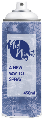
For my final spray can design, I decided to go with the third design that I had set up, as I thought it worked the best as a design for a spray can. The main thing that I liked about this design is the way I used the background, overlaying it onto a grey coloured background to make it somewhat transparent as a background, but it still was able to make an interesting pattern. As well as this, I prefered this logo concept the most out of the ones that I had done, primarily in the way that I was able to keep the “Mid” and “Night” separate. In some of my designs I started using the slogan “A new way to spray”. This originally started as a way to fill in some space in the design, but in the end I enjoyed the way the slogan sounded and it helped make my brand sound unique, so I decided to keep it consistent in the majority of my designs.